The Digital Quill
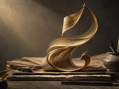
Brush lettering occupies a liminal space between calligraphic discipline and freeform illustration, a position amplified by the algorithmic demands of social media visibility. The digital quill—a term encompassing both stylus on glass and vector pen tool—redefines traditional pressure modulation for pixel-based consumption. Practitioners now navigate a terrain where haptic feedback is simulated through modern calligraphy techniques for digital media rather than felt through the tines of a metal nib.
Unlike the predictable ink flow of paper, the tablet surface requires a recalibration of muscle memory. Artists must consciously exaggerate the transition from hairline upstrokes to shaded downstrokes to compensate for the lack of natural friction. This adaptation creates a hyper-aestheticized letterform uniquely suited to the small screen.
The divergence between analog foundational strokes and digital execution lies primarily in the post-production manipulation of vector nodes. While traditional calligraphers rely on the integrity of the single pass, social media designers frequently engage in non-destructive bezier refinement. This process involves adjusting anchor points to achieve a geometric precision, similar to how certain calligraphy styles inspiring modern typography emphasize structural balance. The resulting typography is not merely written but meticulously sculpted, offering a level of control over counter spaces and terminal endings that would be physically impossible to replicate with a No. 2 sable brush on rough stock.
Why Handcrafted Aesthetics Still Captivate
In an era dominated by generative artificial intelligence and uniform sans-serif templates, brush script stands out as a signal of human presence. Many wonder can AI replicate the art of hand calligraphy, as people scrolling through endless feeds tend to stay longer on content that shows perceived effort and organic variation. This appeal is linked to skeuomorphic comfort, where brush lettering reintroduces the ghost of the hand into an otherwise sterile digital environment, adding texture and imperfection against algorithmic perfection.
This handcrafted visual quality also carries a social and economic role in the creator economy, explaining why hand lettering remains irresistible today. Brands using brush lettering often see higher engagement because it signals artisanal integrity and a clear commitment to craft that stock visuals cannot replicate. Small imperfections like uneven curves or swash weight variations reinforce a sense of tacit authenticity, turning simple content into something perceived as more valuable and human-made.
In saturated social media environments filled with repetitive visual patterns, brush lettering breaks monotony through its nearly infinite variation in stroke, slant, and rhythm. It captures attention by disrupting banner blindness and engaging viewers through the rhythmic texture of thick and thin contrasts. Rather than being processed analytically first, the content is experienced on a more immediate, visceral aesthetic level.
Although modern tools have made brush lettering widely accessible, true mastery remains difficult, and this gap between amateur and professional output creates its social value. Viewers do not just read words; they observe a performance of dexterity in motion, where curves and strokes reflect intentional care. Ultimately, this handcrafted approach introduces slowness and intimacy into digital content, building trust and emotional connection in a fast, pixel-driven environment.
Pressure and Rhythm Mastery
The fundamental architecture of brush lettering relies on a binary state of pressure sensitivity that modern stylus technology has made remarkably intuitive. Achieving a smooth transition from the delicate upstroke to the weighted downstroke requires deliberate practice.
Muscle memory in the forearm must be retrained to suppress tremor while simultaneously increasing downward force. This kinesthetic awareness is the dividing line between jagged amateur attempts and fluid professional scripts, which shows how calligraphy can improve your digital designs and elevate social media branding.
Rhythm extends beyond individual letterforms into the connective tissue of the word itself. The spacing and angle of ligatures dictate the overall visual cadence and perceived movement across the screen. An inconsistent rhythm manifests as a stuttering visual flow, which disrupts the seamless consumption of short-form video overlays or static quote graphics. Conversely, a masterful command of rhythm allows the viewer to glide along the baseline without conscious obstruction, absorbing the message while appreciating the craft. Digital tools offer aids like stroke smoothing and stabilization, but these algorithms can often flatten the very organic pulse that makes brush work compelling.
The introduction of variable font technology and customizable brush settings in applications like Procreate and Adobe Fresco has created a new lexicon of pressure curves. Artists are no longer confined to the linear response of physical bristles. They can map the stylus input to an exponential curve, creating a dramatic contrast swell with minimal physical effort. This modification is particularly advantageous for creating oversized display text intended for Pinterest pins, where the thumbnail must be legible yet highly textured. Understanding how to adjust the pressure smoothing percentage is as critical to the digital lettering artist as choosing the correct nib size was to the sign painter of the previous century.
A comparative analysis of common brush settings reveals distinct applications for various social media formats. The following table outlines the relationship between software parameters and their resulting visual impact on feed graphics. Selecting the appropriate combination can mitigate the need for excessive manual node editing, preserving the spontaneous energy of the initial stroke while ensuring the final output meets the rigorous resolution standards of platforms like Instagram and LinkedIn.
| Brush Parameter | Low Setting Effect | High Setting Effect | Ideal Social Media Use |
|---|---|---|---|
| StreamLine (Stabilization) | Raw, wobbly character; high authenticity | Smooth, geometric curves; less human error | High for Reels covers; Low for Stories doodles |
| Taper Length | Blunt, marker-like endings | Sharp, elegant hairlines and swashes | High for fashion captions; Medium for quotes |
| Pressure Dynamics | Subtle variation; monoline aesthetic | Extreme thick/thin contrast; high drama | High for attention-grabbing headlines |
Composition Flow in a Square Frame
The notorious square aspect ratio of the Instagram grid imposes a spatial discipline that often conflicts with the expansive horizontal nature of Western calligraphy. Navigating this constraint requires strategic visual hierarchy.
A common pitfall among novice lettering artists is the tendency to center a single word perfectly within the frame, creating a static and unmemorable image. Effective composition in this restricted geometry relies on activating the negative space surrounding the letterforms. Diagonal baselines, cascading word stacks, and the intentional bleeding of ascenders off the top edge introduce a sense of dynamic tension. These techniques create visual pathways that guide the eye in a circular motion, prolonging the viewer's engagement with the post.
Integrating brush lettering with other graphic elements demands a sophisticated understanding of visual weight distribution. The thick downstrokes of a brush script carry significant optical mass, which must be counterbalanced by lighter typography, white space, or subtle decorative flourishes. When pairing a bold brush header with body text for an educational carousel, the relationship between the two must be hierarchical yet harmonious. Failure to achieve this equilibrium results in a composition that feels either top-heavy and oppressive or disjointed and chaotic, reducing the likelihood of the graphic being saved or shared by the user.
The following list details key compositional adjustments specifically tailored for the visual economy of mobile-first social platforms. These principles are derived from the study of eye-tracking heat maps on popular design accounts.
-
📌
Corner Anchoring Use heavy swashes or descenders to anchor the design into the bottom left or right corner, preventing the visual from floating aimlessly in the feed.
-
📐
Rule of Thirds Baseline Avoid centering the main word. Align the primary lettering block with one of the vertical or horizontal intersecting power points of the grid overlay.
-
⚠️
Banner Blindness Buffer Keep crucial parts of the message (like dates or handles) at least 40 pixels away from the top edge to avoid being obscured by the platform's native interface elements.
-
🎨
Texture Contrast Pair a high-resolution scanned paper texture with vector-sharp lettering to increase the perception of tactility and depth in a flat digital display environment.