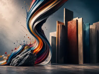
Chromatic Alchemy
Color composition transcends mere pigment application, constituting a foundational grammar of visual language that governs interaction, spatial perception, and symbolic communication within a two-dimensional plane. It is the deliberate orchestration of hues, values, and saturations to achieve structural coherence and convey specific aesthetic or narrative intentions. This complex discipline integrates principles from optics, psychology, and cultural studies to form a holistic framework for artistic practice.
At its core, color composition involves manipulating relationships on the color wheel. Primary, secondary, and tertiary colors serve as the basic lexicon. The artist's skill lies in deploying these elements to establish harmony, create focal points, and guide the viewer’s cognitive and emotional journey through the artwork, making every chromatic choice a calculated semantic decision.
The Emotional Spectrum and Color
Beyond formal arrangement, color operates as a potent psychological trigger. Different wavelengths of light are processed not just by the visual cortex but by limbic system structures, evoking pre-conscious affective responses. Warm hues like cadmium red or ochre often stimulate arousal, while cool blues and greens typically induce calmness, a principle leveraged from Baroque drama to minimalist abstraction.
This emotional efficacy is not universal but is filtered through personal and cultural lenses. However, consistent patterns allow artists to craft predictable atmospheric conditions within a painting. The strategic use of a melancholic blue versus a virulent yellow can fundamentally alter the narrative tone, making color a primary carrierr of pathos in non-figurative works where traditional storytelling elements are absent.
The psychological impact is further nuanced by value and saturation. A muted, desaturated green (sage) may evoke tranquility or decay, while its highly saturated counterpart (lime green) can signal vibrancy or artificiality. This dimensional understanding allows the painter to modulate emotional intensity with precision, using saturation gradients to imply depth, focus, or temporal shifts within the pictorial space, thereby creating a layered emotional topography.
| Color Family | Common Psychological Associations | Art Historical Example |
|---|---|---|
| Reds & Oranges | Passion, danger, energy, warmth | Caravaggio's use of red in "The Calling of St. Matthew" to divine attention |
| Blues & Violets | Calm, spirituality, melancholy, depth | Picasso's "Blue Period" works expressing sorrow and alienation |
| Yellows & Greens | Joy, sickness, nature, renewal | Van Gogh's sunflowers symbolizing friendship and vitality |
Harmony and Contrast in Visual Choreography
The structural integrity of a painting is largely determined by the equilibrium between chromatic harmony and contrast. Harmony, achieved through analogous or monochromatic schemes, creates visual unity and repose. In contrast, complementary or triadic schemes generate dynamic tension and vibrancy, essential for establishing visual hierarchy.
Master painters manipulate these relationships not as binary opposites but as a continuum. A predominantly harmonious composition might be punctuated by a stark discordant accent color, a technique used to startling effect by the Fauves. This controlled dissonance acts as a visual catalyst, preventing monotony and directing analytical focus to semantically charged elements, thereby transforming color into an active narrative agent rather than a passive filler of forms.
The physiological basis for this lies in opponent-process theory, where the eye simultaneously processes color in opposing pairs (red-green, blue-yellow, black-white). Simultaneous contrast, a phenomenon where a color appears to shift in hue based on its surrounding field, is a critical tool. Josef Albers' seminal work demonstrated how the same gray can appear warm or cool, a principle that allows artists to create illusory depth and spatial vibration without altering local hue. This interplay is the choreography of vision, where colors are not static but performatively interact, their perceived identity constantly reshaped by their neighbors, demanding a compositional strategy that anticipates and guides this perceptual dialogue.
- Analogous Harmony: Utilizes colors adjacent on the wheel (e.g., blue, blue-green, green). Creates serene, cohesive moods, often seen in Impressionist landscapes.
- Complementary Contrast: Employs colors opposite each other (e.g., red & green). Maximizes vibrancy and visual pop, crucial for creating focal points.
- Split-Complementary Scheme: A base hue plus the two colors adjacent to its complement. Offers strong contrast but with less tension than a straight complementary pair.
- Triadic Harmony: Uses three colors evenly spaced around the wheel. Provides rich, dynamic contrast while retaining a fundamental balance.
Guiding the Eye Through Spatial Arrangement
Color possesses an inherent spatial valence. Warm, saturated colors tend to advance in pictorial space, while cool, desaturated hues recede. This optical property allows artists to sculpt depth on a flat canvas, creating convincing illusions of three-dimensionality without relying solely on linear perspective.
Advanced composition uses this principle to construct visual pathways. A sequence of strategically placed, high-advancement colors can lead the viewer's gaze on a predetermined journey across the canvas, from primary subject to secondary details. This chromatic orchestration controls narrative pacing and information revelation, making the viewing experience a temporal as well as spatial event.
The concept of atmospheric perspective is a direct application, where distant elements are rendered with progressively cooler, lighter, and less saturated tones to mimic the scattering of light by the atmosphere. Beyond realism, abstract expressionists like Mark Rothko used layered, hovering fields of color to create immense, ambiguous depths that feel simultaneously intimate and infinite. The spatial arrangement of color blocks—their edges, overlaps, and intervals—directs subconscious eye movment, creating rhythms and pauses. This manipulation of visual weight and location is akin to musical composition, where the placement of a chromatic "note" in the pictorial field determines its impact within the overall perceptual symphony.
The Symbolic and Cultural Dimensions of Color
Color symbolism is a culturally constructed language, where hues acquire specific semantic loads that vary dramatically across historical and geographical contexts. This dimension moves beyond the physiological and psychological into the realm of semiotics, where color functions as a signifier within a complex system of shared cultural knowledge.
For instance, the perception of white as a symbol of purity in Western cultures contrasts with its association with mourning in parts of East Asia. An artist operating within or addressing a specific cultural milieu must navigate these codes deliberately. The use of ultramarine blue in medieval European art, derived from precious lapis lazuli, was not merely an aesthetic choice but a theological and economic statement, reserved for the robes of the Virgin Mary to signify divine status and celestial connection.
This cultural coding is often institutionalized and evolves over time. The revolutionary connotations of red, from the Phrygian cap of the French Revolution to socialist realism, demonstrate how color can embody political ideology. Similarly, the sacred status of saffron in Hindu and Buddhist iconography, or the prohibition of certain colors in specific social strata in historical Japan (sumptuary laws), reveals color's role in structuring social and spiritual hierarchies. A contemporary globalized art market further complicates this, as artists must consider the transcultural reception of their chromatic symbols, leading to either intentional universalism or pointed commentary on cultural specificity.
The application of this knowledge requires meticulous research and sensitivity. A painter engaging with mythological or historical themes must adopt the appropriate chromatic palette to achieve authenticity or intentional anachronism. This symbolic layer adds profound depth, allowing a single color to simultaneously operate on formal, emotional, and narrative levels, making the composition a dense, multi-layered text to be decoded by the informed viewer.
| Color | Western Symbolism (Examples) | Alternative Cultural Symbolism (Examples) |
|---|---|---|
| Red | Love, danger, revolution, passion | Prosperity, luck (China); mourning (South Africa) |
| White | Purity, peace, innocence, weddings | Mourning, death (Japan, India); cleanliness (global) |
| Black | Mourning, evil, formality, elegance | Maturity, wisdom (some Indigenous cultures); rebirth (Ancient Egypt) |
| Yellow | Caution, joy, cowardice | Royalty, sacred (Imperial China); mourning (Egypt) |
- Iconographic Colors: Specific hues mandated by religious or traditional conventions, such as gold for halos in Byzantine icons or blue for Krishna in Hindu art.
- Sociopolitical Colors: Hues adopted by movements or states, e.g., the green of environmentalism, the pink triangle reclaimed by LGBTQ+ rights activists.
- Personal Symbolism: An artist's idiosyncratic color lexicon developed over a career, like Yves Klein's patented International Klein Blue (IKB).
Beyond Pigment
Contemporary discourse and practice have radically expanded the concept of color composition beyond traditional materiality. Digital media, light installations, and interactive artworks treat color as pure light or data, governed by additive (RGB) rather than subtractive (RYB/CMYK) mixing systems.
This shift introduces variables like luminosity, refresh rate, and user-determined variability, challenging static notions of composition. In generative or algorithmic art, color relationships can be programmed to evolve in real-time, creating compositions that are dynamic and non-repeatable. The artist becomes a system architect, designing rules for chromatic interaction rather than fixing a finite arrangement, which fundamentally questions authorship and the artwork's ontological status.
Advancements in materials science introduce physical pigments with novel properties—photochromic, thermochromic, or iridescent—that change color based on environmental stimuli. This creates a temporal dimension to color composition, where the artwork exists in a perpetual state of flux, and the viewer's experience is uniquely temporal and conditional. Conservation science also intersects here, as the original color composition of an Old Master painting is often obscured by aged varnishes and pigment degradation, reminding us that the perceived composition is not static but a palimpsest of material history.
The philosophical implications are profound. If color is a relational event rather than a fixed substance, then composition becomes a process of orchestrating potentialities and contextual dependencies. This contemporary framework does not invalidate traditional principles but layers them with new complexities, postioning color composition as a perpetually evolving discipline at the intersection of art, technology, and perceptual science, demanding a literacy that spans from ancient fresco techniques to the latest digital rendering algorithms.